CVS Health – Order management
Simplifying complex prescription management flows
This work focused on redesigning CVS Pharmacy’s Order management experience across iOS, Android, and web.
Building on insights from the “Your orders” redesign, I led UX and UI improvements across complex prescription scenarios, helping customers better understand issues, timing, and next steps.
Project overview
Role
Lead UX/UI Designer
Team
Product leadership
Product stakeholders (Business)
Research and accessibility partners
Content designer
Design system team
iOS, Android, and web engineers
Junior UX/UI designer
Platform
iOS • Android • Web
Key deliverables
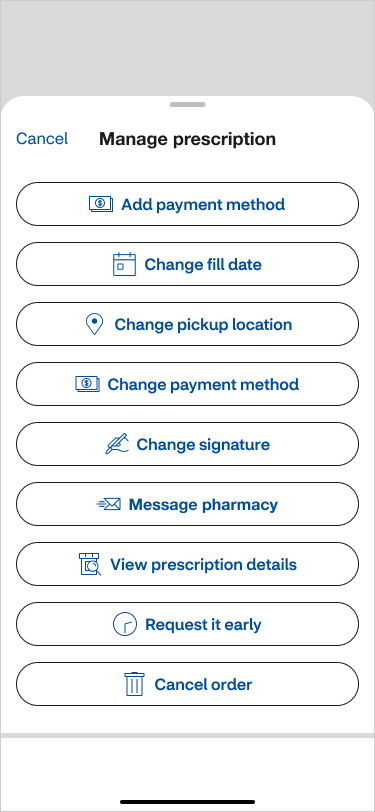
Manage prescription CTA and actions
Order details and cancellation flows
Message pharmacy experience
Pharmacy details screen
Scalable components and QA documentation
The problem
After redesigning the “Your orders” experience, we learned that confusion didn’t stop at the main order screen.
The same issues appeared across Order management, especially when prescriptions were delayed, canceled, or needed follow-up.
The challenge was to extend the clarity from “Your orders” across the full management experience and support many complex scenarios across mobile and web.
Discovery
This work built on insights from the Your orders research.
Prescription management is often:
time-sensitive
emotional
done quickly on mobile
I reviewed existing order management screens to understand where confusion occurred.
I also studied best-in-class pharmacy and retail experiences to see how complex order states are handled.
Strong patterns included:
Clear status labels
Simple layouts
Easy-to-find actions
Low visual noise
Strategy
This work extended the clarity established in Your orders into Order management screens.
The goal was consistency so users would see familiar patterns, language, and layout across related flows.
I created mobile-first wireframes using scalable Figma components to explore both simple and complex scenarios, including:
viewing order details
canceling an order
messaging the pharmacy
reviewing store details
Key wireframes included:
Order details
Cancel order
Message pharmacy
Store details
Overflow menu states
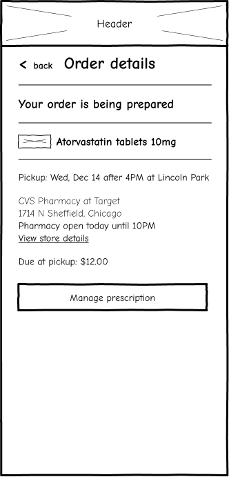
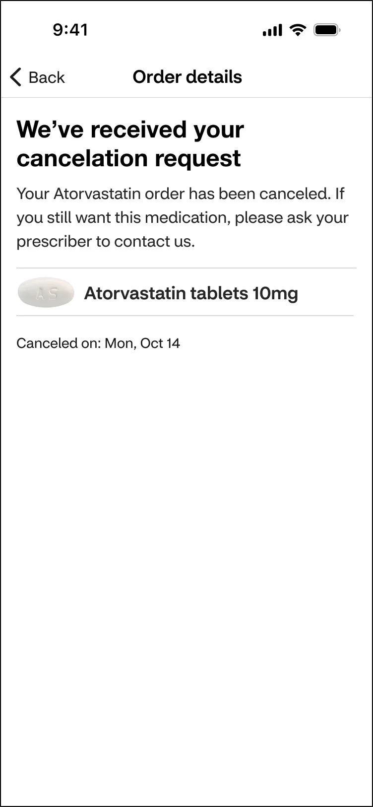
Order details
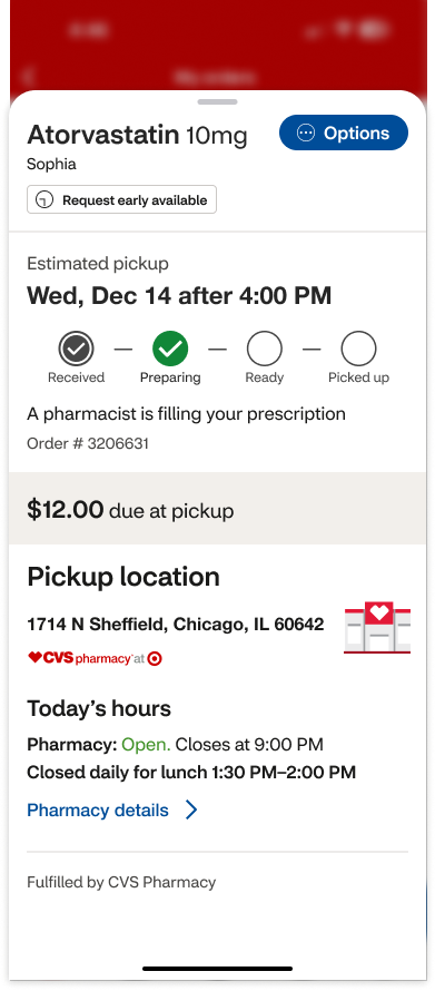
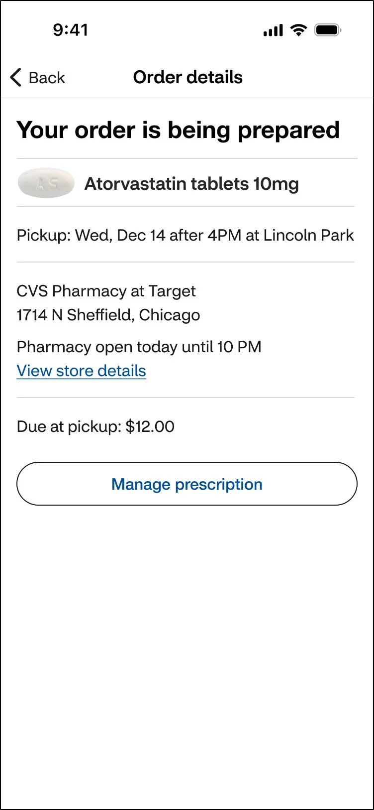
In the wireframes, I restructured the screen to improve clarity, hierarchy, and usability:
Switched from a bottom sheet to a full-page layout for better readability
Added a clear screen title (“Order details”) for orientation
Moved the prescription status to the top, where users look first
Placed the medication name and photo directly beneath it for quick recognition
Removed low-value or redundant elements (tracker, repeated messaging, internal order numbers)
Established a clear information flow: Status → Medication → Pickup Details
Replaced the vague “Options” button with a single primary action: Manage Prescription
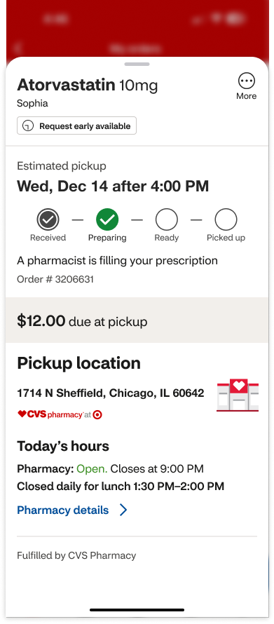
Legacy design
Redesign
Overcoming constraints
After completing the “Your orders” redesign, I saw an opportunity to extend the same clarity across Order Management flows.
Because the work wasn’t prioritized, I treated it as a design study and shared concepts with the team to support future thinking.
The exploration helped me deepen how I connect research insights, UI patterns, and scalable design decisions across complex systems.
Final designs
Order details
Building on the wireframe structure, I applied CVS’s design system styling and refined the UI for a clean, accessible, and easy-to-scan experience.
Legacy design
Redesign
Managing prescription actions
Replaced the vague Options button with a clear primary action: Manage prescription
Made the action CTA full-width to improve visibility and tap targets
Moved secondary actions into a bottom sheet for better readability
Used clear, consistent language (e.g., “prescription” instead of “Rx”)
Legacy design
Redesign
Legacy design
Redesign
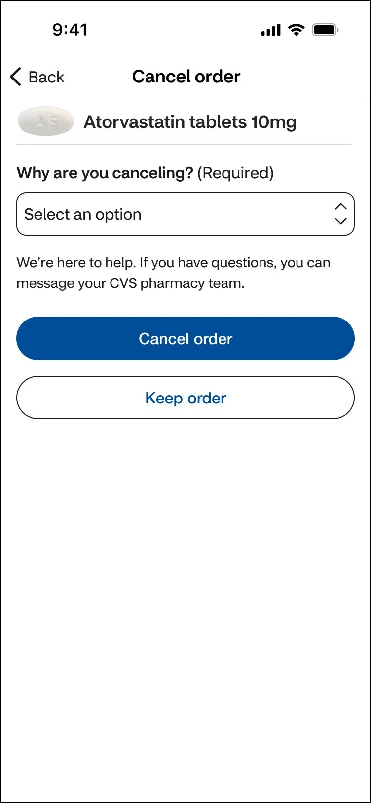
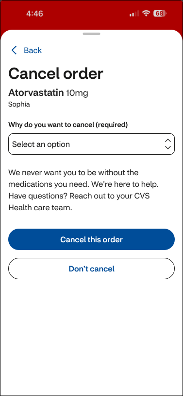
Cancel order
The design focuses only on what matters.
Extra visuals and steps were removed so users can clearly complete the action and understand the outcome.
Legacy design
Redesign
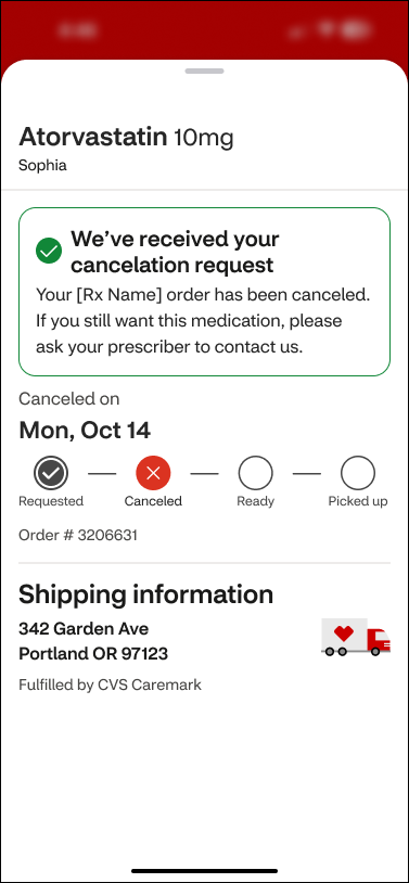
Order canceled
Once canceled, the screen shifts into a simple confirmation state.
No tracker, no success icon — just clear text that confirms the action is complete.
Redesign
Legacy design
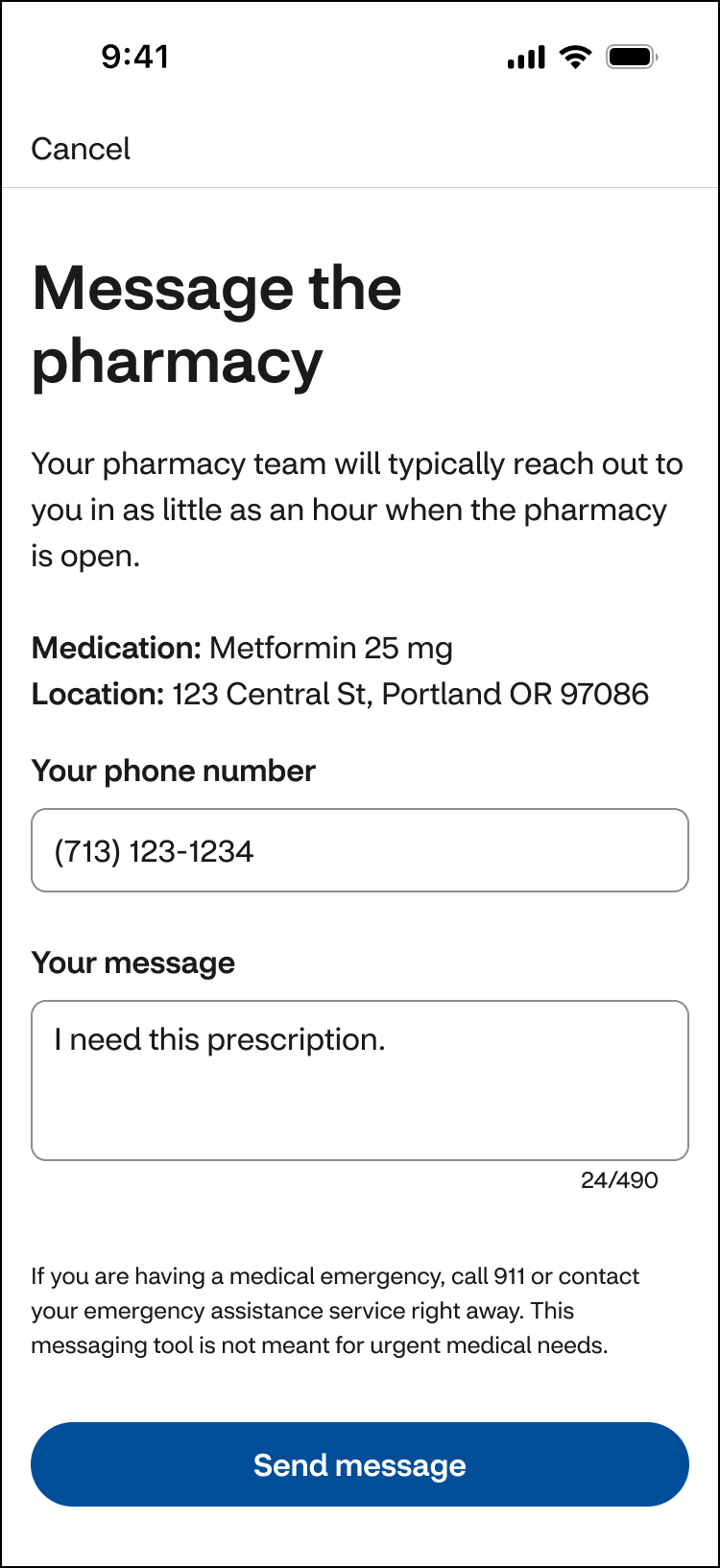
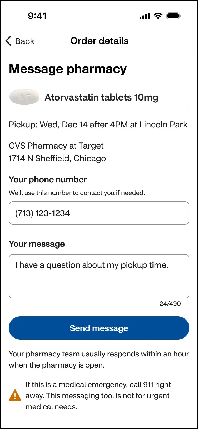
Message pharmacy
The screen follows the same structure as other Order management flows:
Medication name
Pickup details
Pharmacy location
Supporting notes appear near the CTA, and a warning icon highlights emergency guidance.
The result is a calm, focused message experience.
Legacy design
Redesign
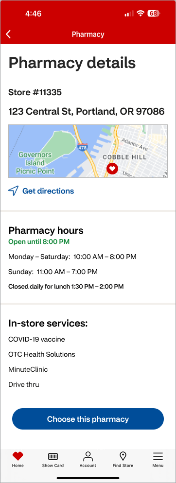
Pharmacy details
I simplified both layout and content to reduce cognitive load.
Changes include:
Fewer varying font sizes for clearer hierarchy
No color-only status indicators
Removed internal store numbers and extra punctuation
Standardized time formatting (e.g., 8PM)
This makes the screen faster to scan and easier to use on mobile.
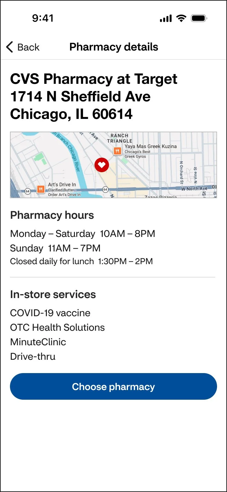
Redesign
Legacy design
Dev handoff & implementation
While this concept work did not ship, I supported the team in a critical way: QA.
The pharmacy design team didn’t have a QA process, so I built one from scratch. I created templates, tracking tools, and clear step-by-step guides to show what was tested, what changed, and what still needed fixes.
I also trained 20+ designers on the process and wrote documentation that new team members used as their starting point.
QA process I created
Create user story (Product + Engineering)
QA the work (Design)
Track outcomes
Defects found → document and assign fixes
No defects → mark complete
Impact & outcomes
Extended the same clarity and structure from “Your Orders” into deeper management flows, creating a more consistent and predictable experience.
Although this work remained a design study, it helped shape better patterns for future features and informed team discussions.
The project reinforced how research-led design and systems thinking can improve complex, time-sensitive workflows.
Team feedback
“Time and time again I’m impressed with the care, thoroughness and great quality of Nancy’s work—both how she works with people and the designs that she produces. She’s able to make good progress while collaborating with fellow designers and SCRUM team members. I note particularly how she gracefully handles many unexpected challenges that come up as details need to be worked out with development teams. When Nancy’s working on something, I’m happy to know I don’t need to worry about it, and I can look forward to excellent work and positive collaboration.” — Design Lead