CVS Health – Your orders
Improving prescription status clarity at national scale
I led a redesign of the “Your Orders” experience across iOS, Android, and web.
User testing showed the existing design was confusing, so I focused on making order status easier to scan and understand. With CVS filling over 4 million prescriptions a day, even small clarity improvements can help millions of people.
Project overview
Role
Lead UX/UI Designer
Team
Product leadership
Product stakeholders (Business)
Research and accessibility partners
Content designer
Design system team
iOS, Android, and web engineers
Junior UX/UI designer
Platform
iOS • Android • Web
Key deliverables
20+ prescription card designs
Simple and complex order scenarios
Scalable Figma components
Design QA templates and documentation
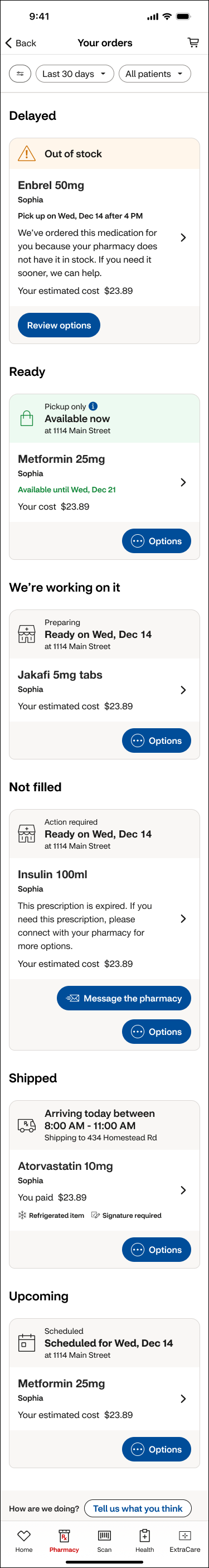
The problem
CVS fills millions of prescriptions every day, and many include issues like insurance delays or out-of-stock medications.
The “Your orders” page is where customers check these updates, but testing showed the information was hard to scan and confusing.
Many people didn’t know what was happening or what to do next.
Discovery
I partnered with a senior researcher to run an unmoderated A/B test on the Your Orders experience.
Test scenarios
A: 6 prescriptions, 1 issue
B: 2 prescriptions, no issues
Research goals
Can users find what they need?
Do they understand next steps?
Does the layout help or confuse?
Participants
10 people with different ages and digital habits who regularly use pharmacy apps.
Test A
Test B
Key findings
The researcher shared a summary deck, which I reviewed and synthesized using AI.
People focused on large status messages and skipped details
Some messages explained what happened but not what to do next
Pickup dates helped only when they matched the real status
Mixed messages caused confusion (ex: “Not filled” + “Ready Wednesday”)
Parent and child statuses often conflicted
“Review options” and “Options” felt unclear and interchangeable
Competitive review
I reviewed leading pharmacy apps (Walgreens, Amazon, Capsule) to see how they handle complex order states. The strongest patterns were calm, simple, and action-led.
Strategy
Based on user testing, I focused on four core goals:
Make status and next steps obvious
Remove mixed or conflicting messages
Group prescriptions by urgency
Reduce stress with clean, calm layouts
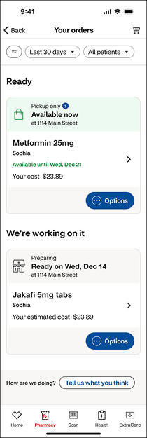
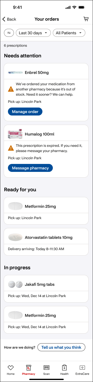
To simplify the experience, I regrouped nine different order statuses into four clear categories:
Needs Attention → replaced Not filled & Delayed
In Progress → replaced We’re working on it, & Upcoming
Ready for You → replaced Ready & Shipped
Completed — Picked up, Delivered, Canceled
This reduced cognitive load and helped customers understand their situation at a glance.
I then rebuilt the prescription cards using scalable design system components and redesigned all 21 order-state scenarios, so the screen supports faster scanning, clearer decisions, and smoother follow-through. Below are six examples.
Prescription cards
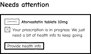
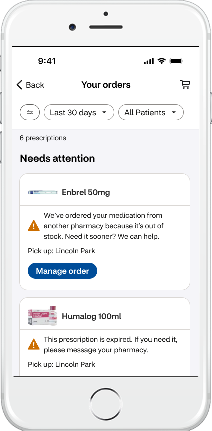
Needs attention — Action required
Combined conflicting messages into one clear parent status
Removed all pickup details until the required action is completed, preventing mixed readiness signals
Removed the Options menu to focus on one next step
Moved drug name to the top and added a product image
Legacy design
Redesign

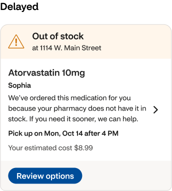
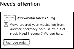
Needs attention — Out of stock
Simplified messaging to show only what matters
Removed misleading pickup dates
Elevated drug name and photo
Legacy design
Redesign
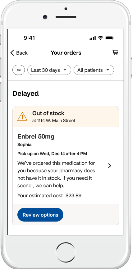
Needs attention — Shipment delayed
Reduced duplicate messaging
Moved address + pricing details to the details screen
Kept the card clean and scannable
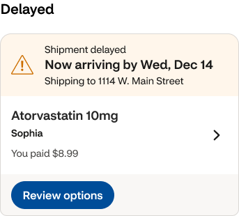
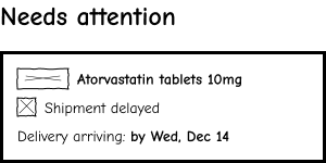
Redesign
Legacy design
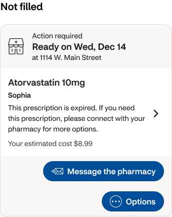
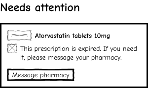
Needs attention — expired prescription
Removed pickup dates and location until the issue is resolved
Kept one clear action: Message pharmacy
Reduced extra CTAs and clutter
Drug name moved to the top + photo
Legacy design
Redesign
In progress
Merged overlapping statuses into a single, clear state: “In progress”
Simplified hierarchy
Clarified SLA
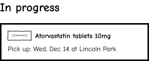
Redesign
Legacy design
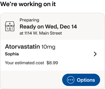
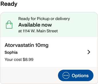
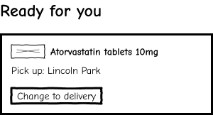
Ready for you
Removed redundant language
Reduced clutter
Added clear CTAs for pickup or delivery
Legacy design
Redesign
Overcoming constraints
This redesign was not formally prioritized, so I explored it independently using real insights from user testing.
I shared the work with designers on the Orders team to spark discussion and inform future improvements.
This gave me space to apply systems thinking and experiment with AI-assisted workflows, while keeping the focus on clarity, scale, and user needs.
Final designs
I applied CVS’s design system, then simplified the screen to reduce visual noise and improve clarity and accessibility.
Key improvements:
Removed extra color bands so each card feels clean, contained, and easy to scan
Added a soft background behind the cards to improve contrast
Removed decorative icons, keeping only warning icons when something needs attention
Added clear medication images to help users quickly recognize what they ordered

All of these changes reduced scrolling on Test A by 67.5%, making the page faster to scan and easier to act on.
Legacy design
Redesign
Redesign
Legacy design
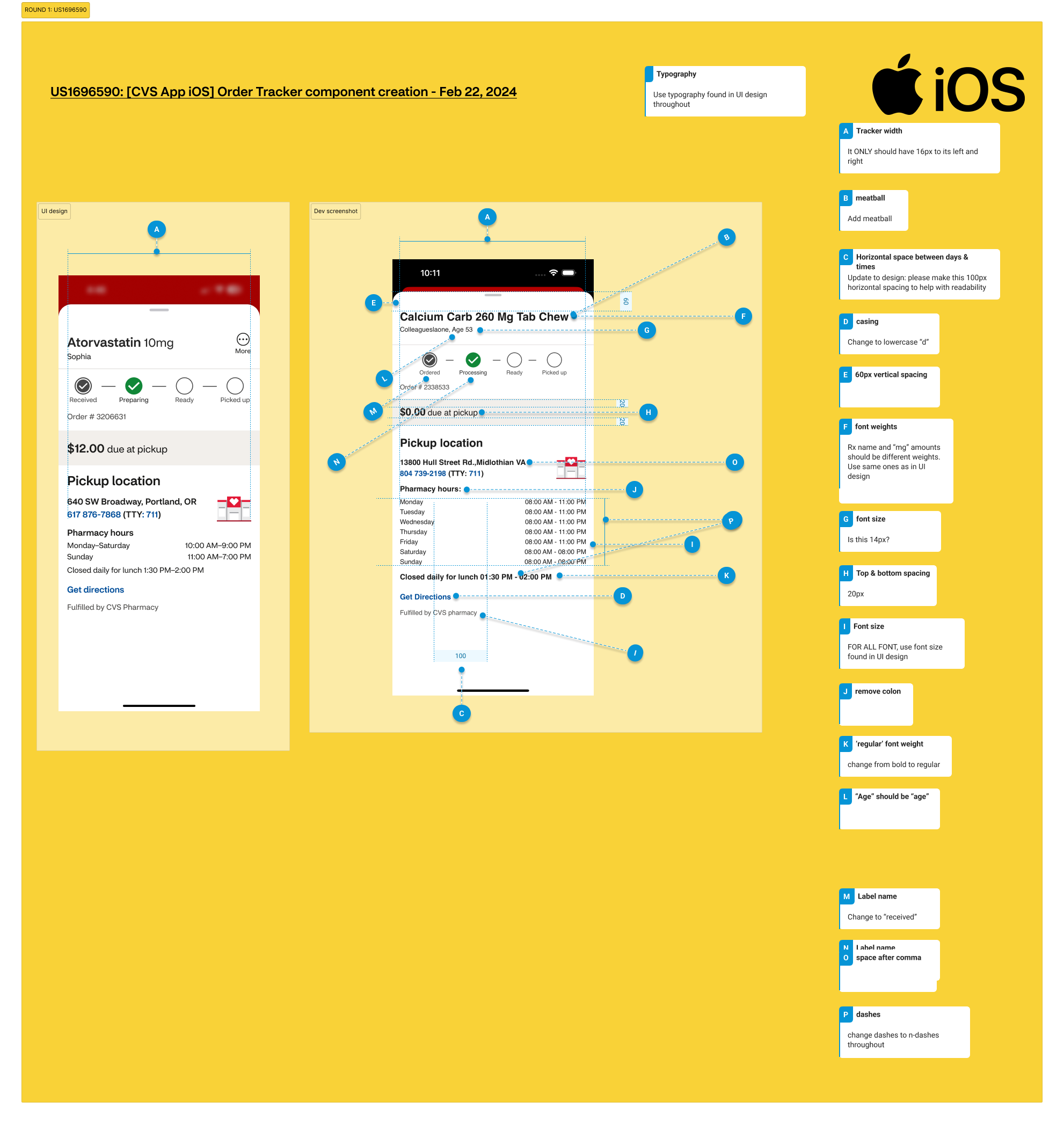
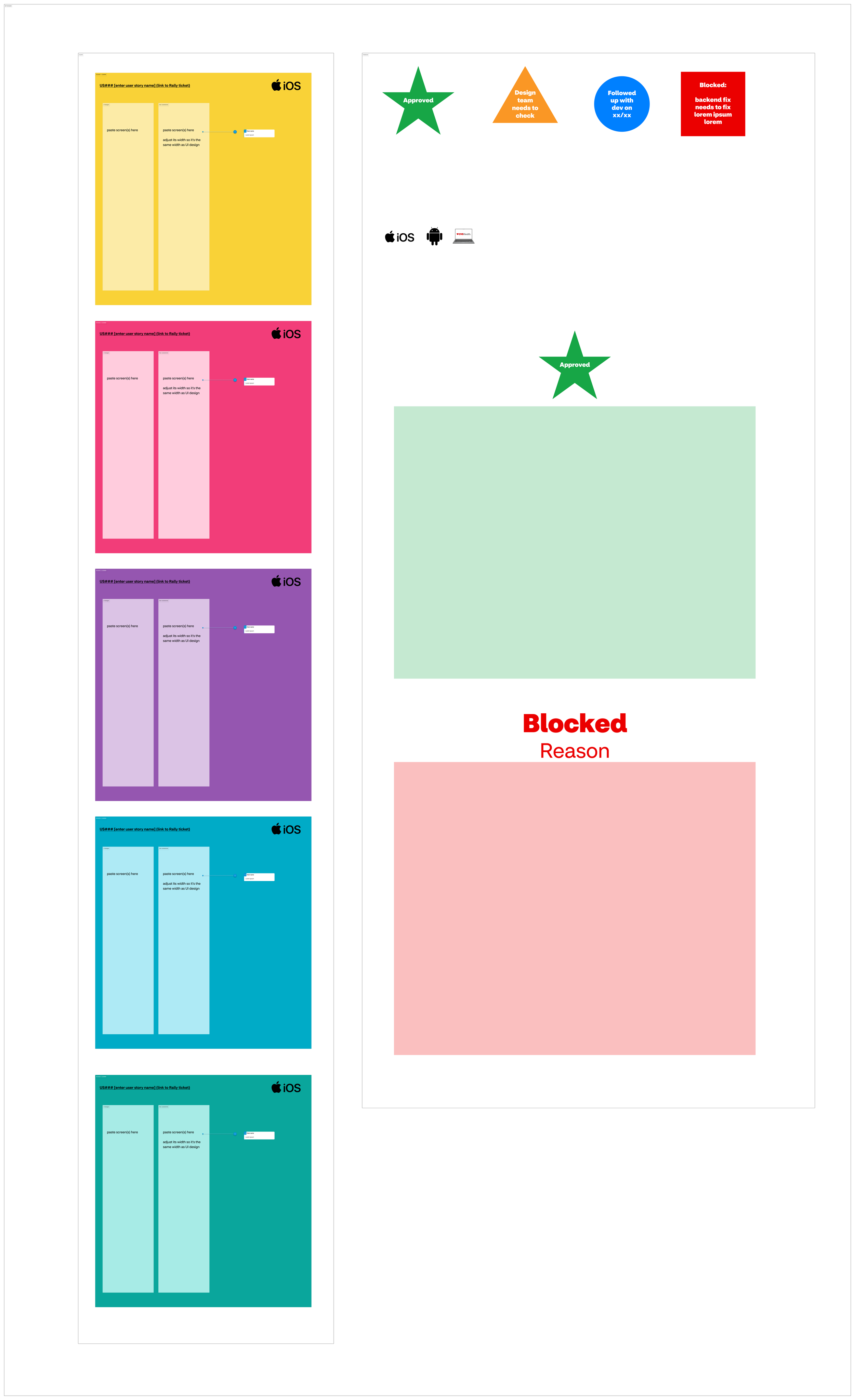
Dev handoff & implementation
While this concept work did not ship, I supported the team in a critical way: QA.
The pharmacy design team didn’t have a QA process, so I built one from scratch. I created templates, tracking tools, and clear step-by-step guides to show what was tested, what changed, and what still needed fixes.
I also trained 20+ designers on the process and wrote documentation that new team members used as their starting point.
QA process I created
Create user story (Product + Engineering)
QA the work (Design)
Track outcomes
Defects found → document and assign fixes
No defects → mark complete
Impact & outcomes
Explored how small, user-tested changes could reduce confusion and stress in a high-volume pharmacy experience.
While this concept work did not ship, it helped inform clearer status patterns, stronger grouping logic, and more scalable card design across the Orders space.
It also strengthened my leadership through QA ownership, mentoring, and advocating for user-centered decisions.
Team feedback
“Time and time again I’m impressed with the care, thoroughness and great quality of Nancy’s work—both how she works with people and the designs that she produces. She’s able to make good progress while collaborating with fellow designers and SCRUM team members. I note particularly how she gracefully handles many unexpected challenges that come up as details need to be worked out with development teams. When Nancy’s working on something, I’m happy to know I don’t need to worry about it, and I can look forward to excellent work and positive collaboration.” — Design Lead