U.S. Bank – Ascent
Designing the first responsive experience for ultra-high-net-worth clients
I led the end-to-end UI design for U.S. Bank’s first responsive website for ultra-high-net-worth clients (those with $75M+ in investable assets).
I created the core visual concept, final UI designs, and a flexible component library to help future teams stay clear, consistent, and on brand.
Project overview
Role
Lead UI Designer
Team
Marketing leadership
UX leadership
UX producer
Copywriting and SEO partners
Accessibility specialist
Junior UX designer
Platform
Web
Key deliverables
Homepage and top-level landing pages
Secondary content pages
Scalable page templates
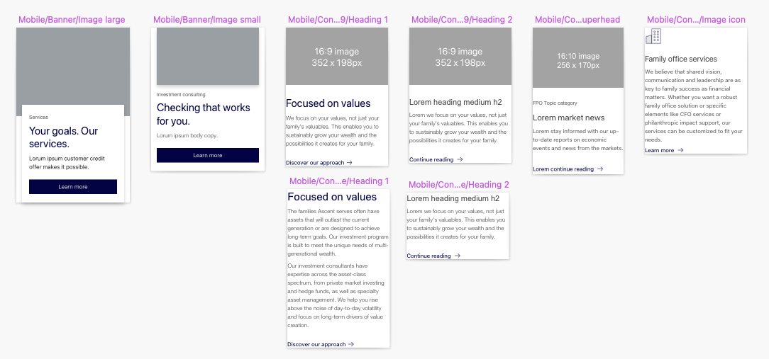
Modular component library for future growth
The problem
The Ascent site felt outdated and didn’t work well on mobile or tablet.
It was built on an older system that was hard to update and didn’t match the trust or polish expected by ultra-high-net-worth clients.
The site also didn’t clearly explain what Ascent offers or reflect the premium service behind it.
Discovery
I reviewed luxury brands and financial competitors to understand how trust and exclusivity show up online.
The strongest experiences felt:
Simple
Confident
Intentional
They avoided clutter and used strong visuals to signal quality.
These patterns helped shape the visual direction for Ascent.
Strategy
I partnered closely with a UX designer and marketing leads to align on brand goals and client expectations.
Together, we reviewed:
existing content
user flows
technical constraints
This helped clarify where the experience felt dated and difficult to maintain.

We iterated on wireframes to refine hierarchy, flow, and content structure.
Visual exploration
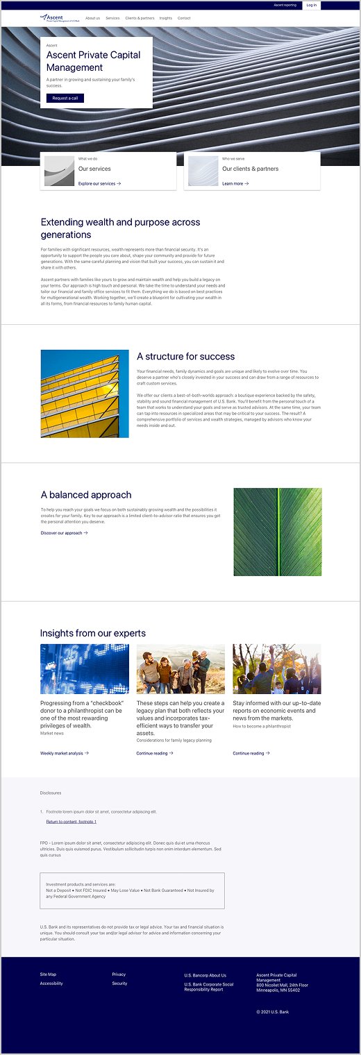
For early UI concepts, I explored a refined, minimal direction that felt premium but still aligned with the broader U.S. Bank brand.
The first concept used soft metallic tones.
The second explored warmer, natural textures.
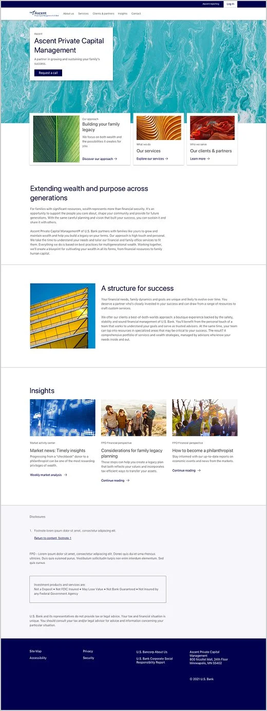
Both directions aimed to feel modern, trustworthy, and appropriate for ultra-high-net-worth clients.
Overcoming constraints
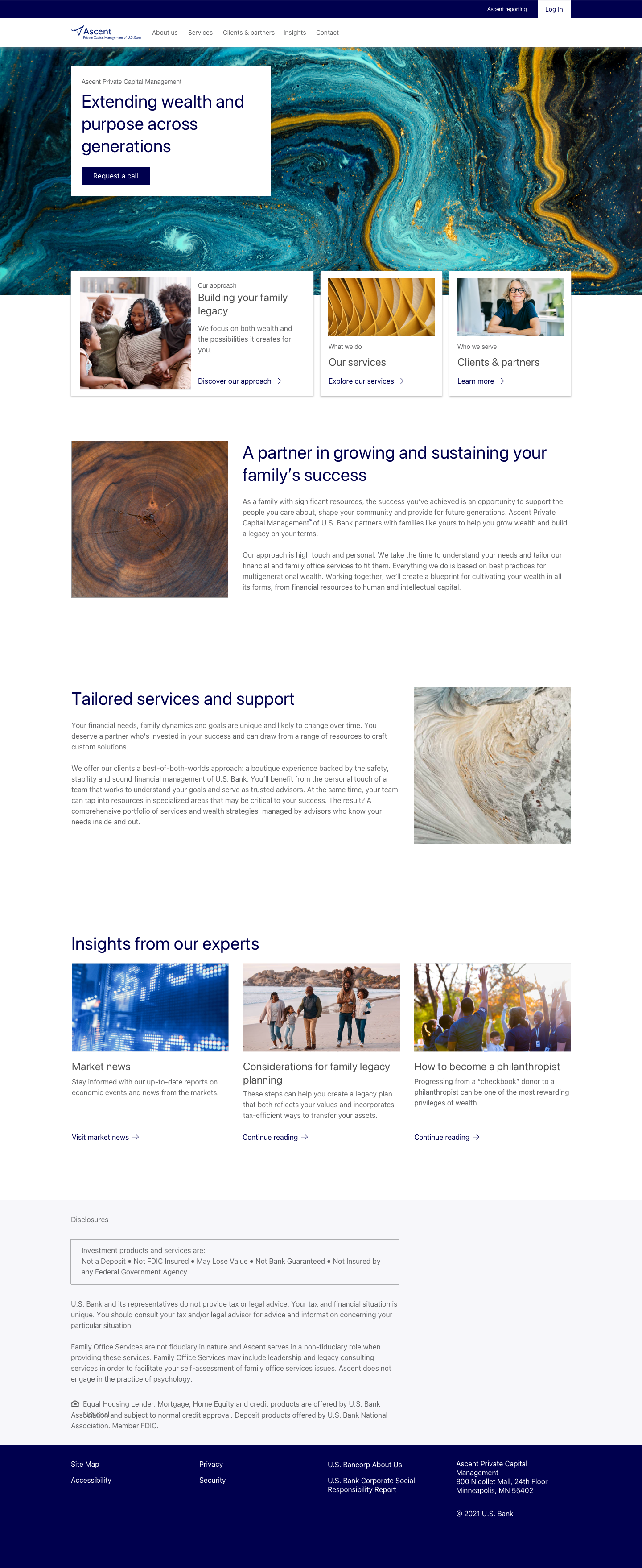
One challenge was aligning on visual direction with a design leader. While there were differing opinions on homepage photography, I partnered closely with marketing to evaluate options against brand goals and audience expectations. After reviewing alternatives, the marketing team and Ascent president aligned on the original marble image I recommended, with small refinements made elsewhere to reach consensus.
Another challenge was U.S. Bank’s common use of background color to separate sections. For Ascent, I proposed a cleaner approach (white backgrounds with subtle dividers) to create a more refined, premium feel. With marketing’s support, the team implemented this new pattern, helping the site feel modern, trustworthy, and distinct.
Final designs
Homepage
The marble image anchors the homepage with a timeless, premium feel.
Clean layouts, bold imagery, and minimal background color keep the focus on content and trust.
Abstract visuals are paired with human imagery to feel both polished and personal.

Landing pages
Section overview pages use full-width imagery and short copy to set a confident, high-end tone.
The color palette stays restrained (navy, gray, silver, soft teal, and burnt orange) reinforcing clarity and elegance.
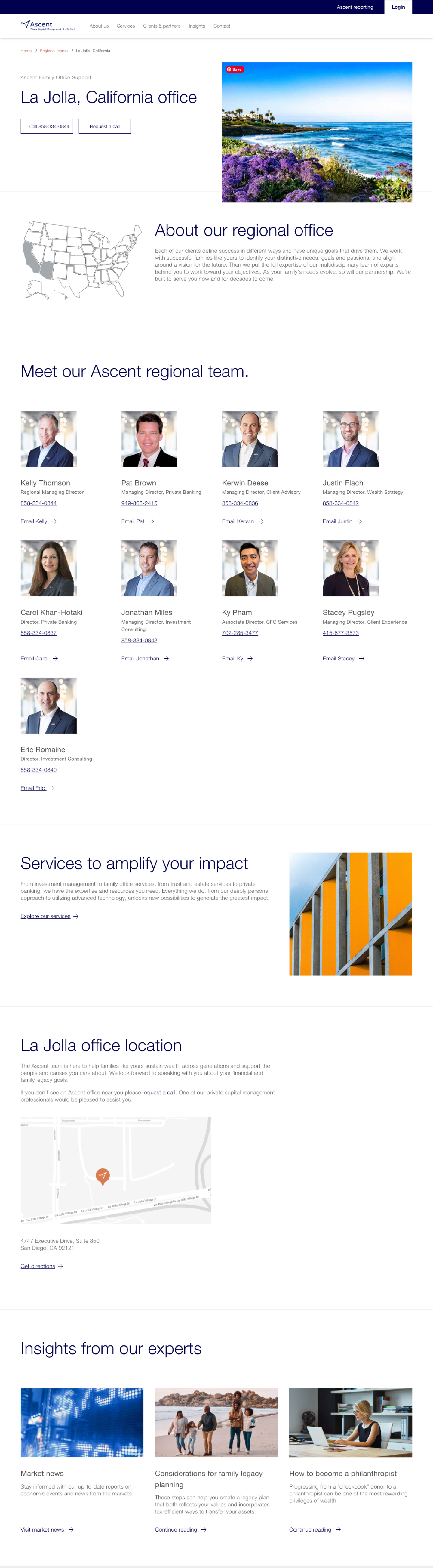
Subpages
Deeper pages use lighter banner visual treatments to signal hierarchy.
Regional pages feature unexpected nature imagery and custom grayscale maps to feel modern, refined, and non-touristy.
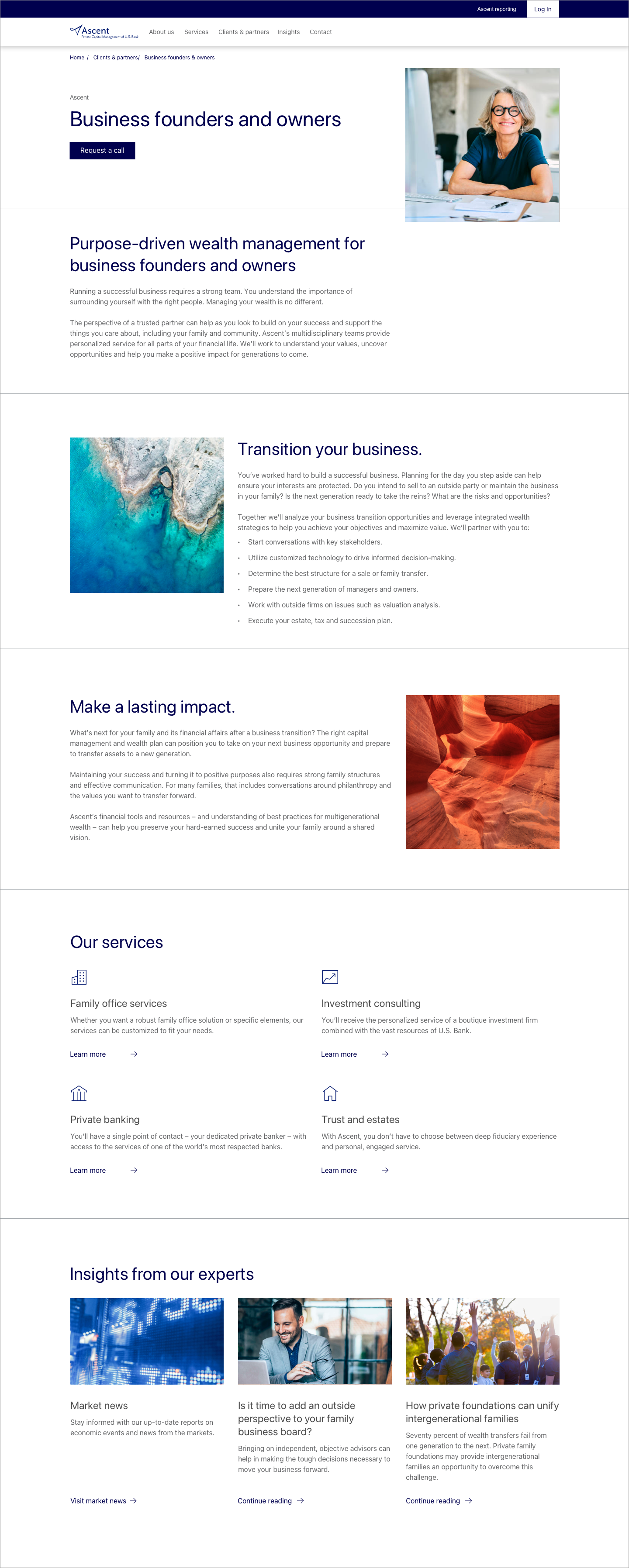
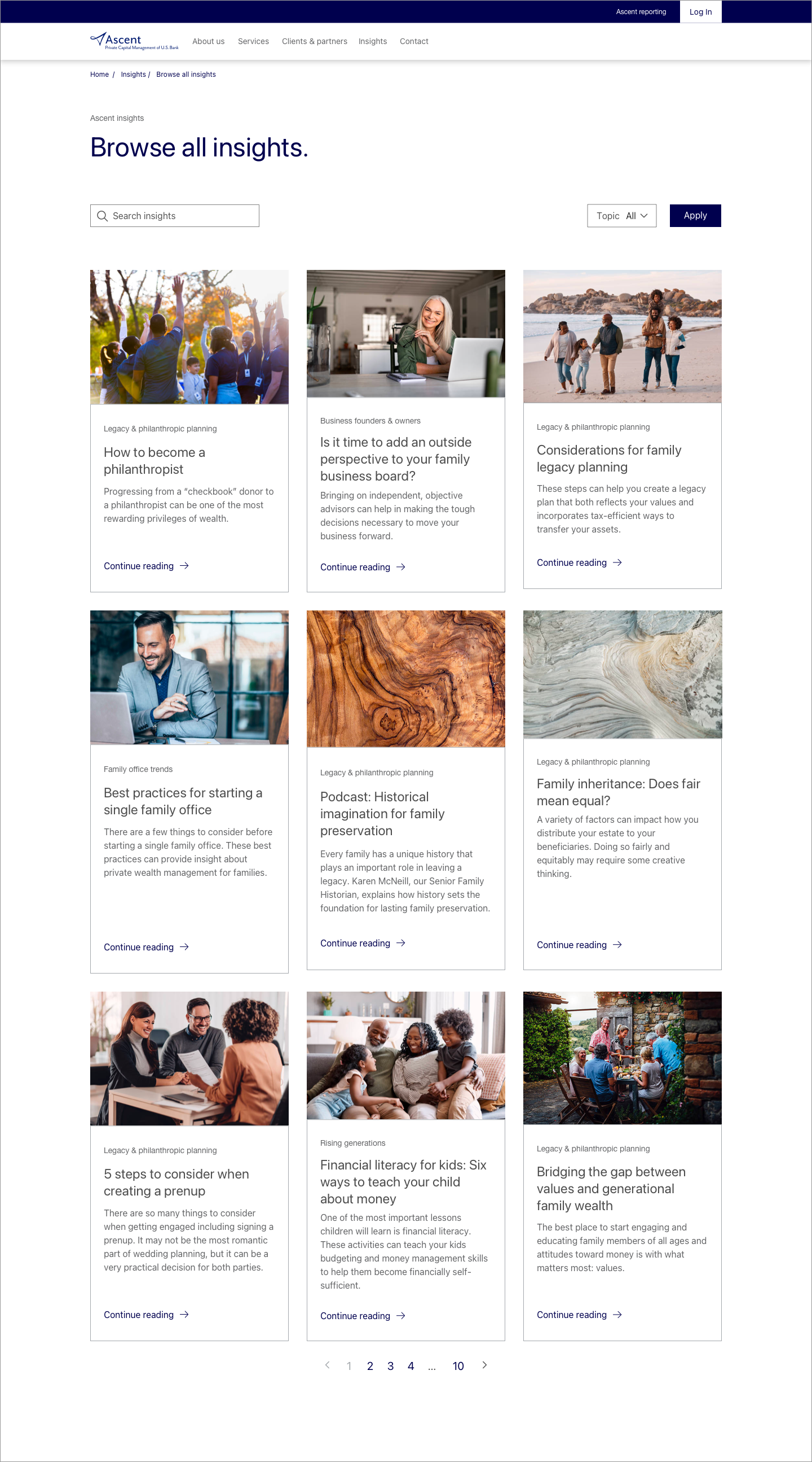
Content pages
Long-form pages use a soft banner and narrow text width (about 700px) for readability.
Images are used sparingly so content stays the focus.
Dev handoff & implementation
Direct developer collaboration was outside my role, so I focused on a strong handoff. I delivered polished high-fidelity designs, a solid Sketch library, and clear documentation so developers could build with confidence and support future analytics.
Impact & outcomes
Elevated the Ascent brand with a clean, premium experience that felt modern, trustworthy, and distinct from other U.S. Bank sites.
The new layout and visual system gave marketing a flexible foundation for future updates and analytics, while maintaining consistency across devices.
This project showed how thoughtful collaboration and challenging legacy patterns can lead to stronger, shared outcomes.
Team feedback
“So much GOOD to say about Nancy… Her creativity as a designer, attention to detail, and collaborative nature are just the tip of her talent iceberg. Within her 6 month contract Nancy delivered an impressive body of work which included branding a new website, building out the style guide, and creating a comprehensive Sketch library for the team to carry forward. What a treat to have her as part of the team and fingers crossed I’ll get to work with her again. Thank you, Nancy!”— Design VP, Wealth Management