Ore-Ida
Creating the brand’s first digital experience
Ore-Ida is best known for inventing the Tater Tot, but until this project, the brand had no website.
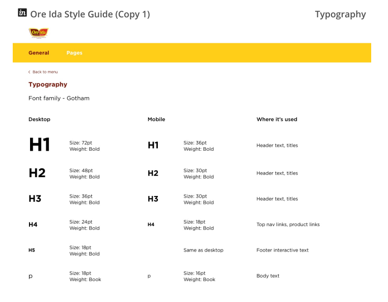
I led the end-to-end UI design for their first responsive digital experience across desktop and mobile. I also oversaw the creation of a style guide to help future teams stay consistent as the site grows.
Project overview
Role
Lead UI Designer
Team
Brand manager
UX designer
Producer
Junior UI designer
Platform
Web
Key deliverables
Homepage and product landing pages
Category and product detail templates
Recipes experience
Style guide for development and future scale
The problem
Ore-Ida is a well-known brand, but it didn’t have a website. This made it hard for families to learn about the products or explore what the brand offers.
Discovery
Ore-Ida did not yet have a website, so early discovery focused on understanding the brand and audience.
I partnered with the UX designer and brand team to review:
content needs
product categories
long-term growth plans
I also reviewed family-friendly brands and competitors to understand how they balance fun with clarity.
The strongest examples used:
bold visuals
playful moments
simple structure
These insights shaped the foundation for Ore-Ida’s first digital experience.
Strategy
I partnered with a UX designer and the brand team to shape the structure for Ore-Ida’s first site.
Exploration
I explored two visual directions to match the brand personality:
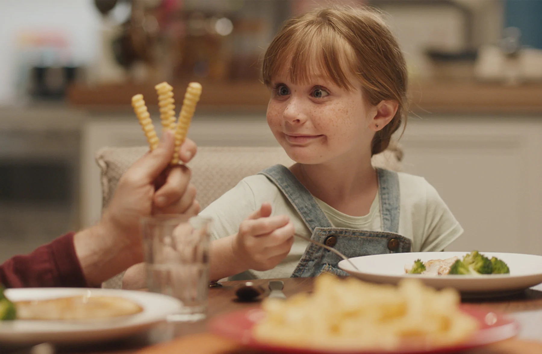
Concept 1: brand reds + farmland + product photos for a grounded, quality feel

Concept 2: packaging + human moments + brighter palette for a more energetic story
Overcoming constraints
Ore-Ida’s brand colors (brown, red, and yellow) created accessibility and balance challenges.
I adjusted contrast and usage to keep the experience clean and readable while staying true to the brand.
Another challenge was content density. I simplified the homepage with progressive disclosure, keeping the layout clear without losing important brand storytelling.
Final designs
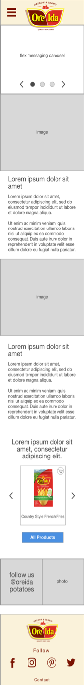
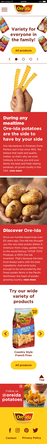
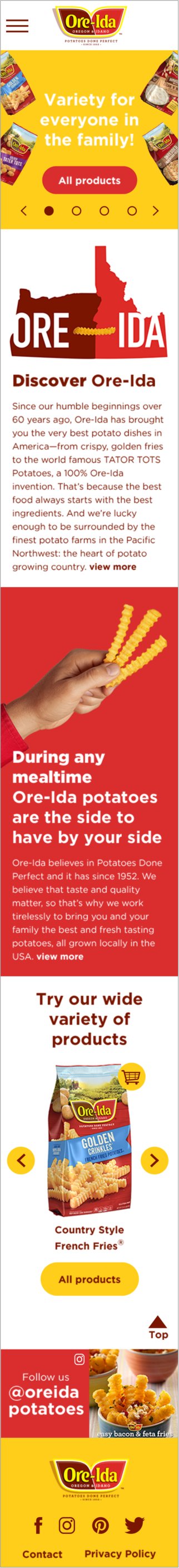
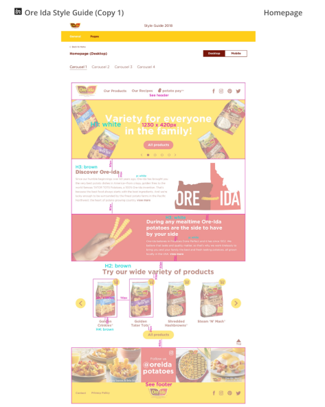
Homepage
I used a brighter, accessible yellow and featured new packaging to set a fun, modern tone.
The layout alternates imagery and copy to create rhythm, pulling from Ore-Ida’s core colors while keeping the experience fresh.
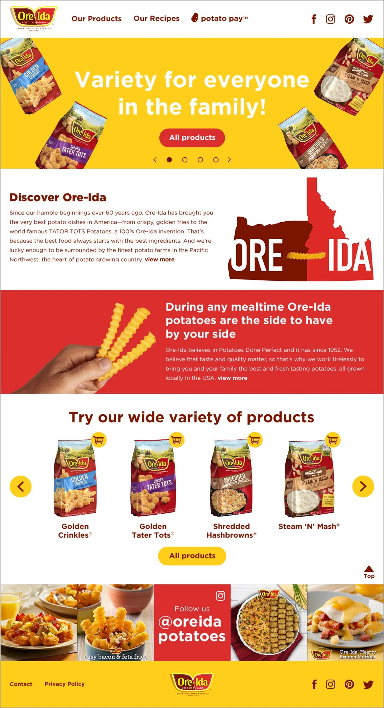
Products landing pages
Product types are easy to scan, with large images and clear product names beneath each.
The simple grid layout helps users quickly find what they’re looking for without extra effort.
Category pages
Each category shares a flexible layout with custom banners.
Product detail pages
Product pages are easy to scan, with short text blocks and consistent structure to help users find what they need quickly.
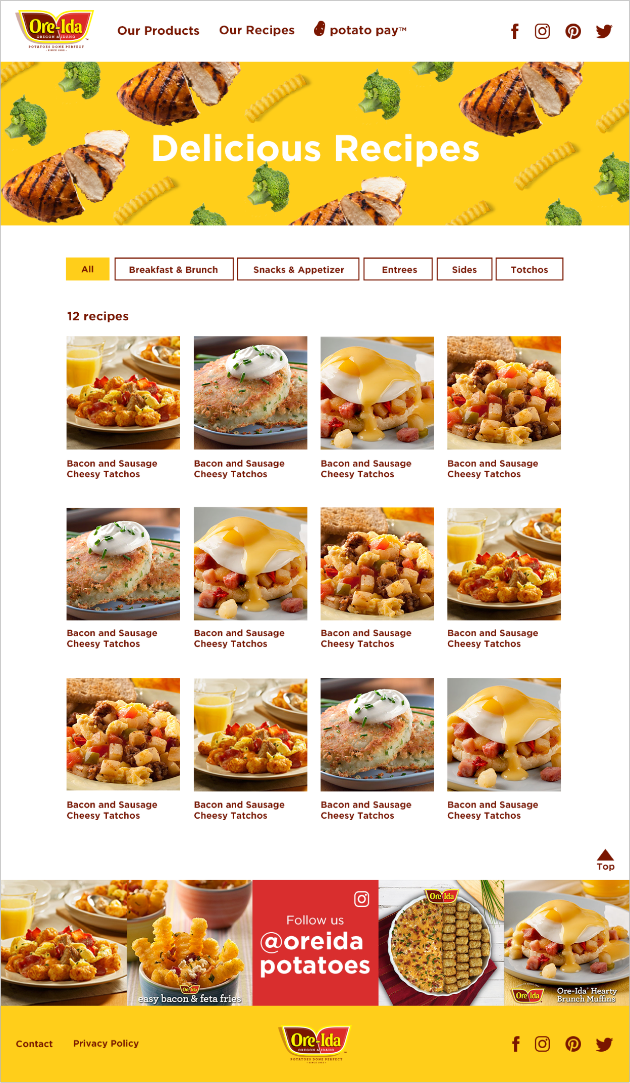
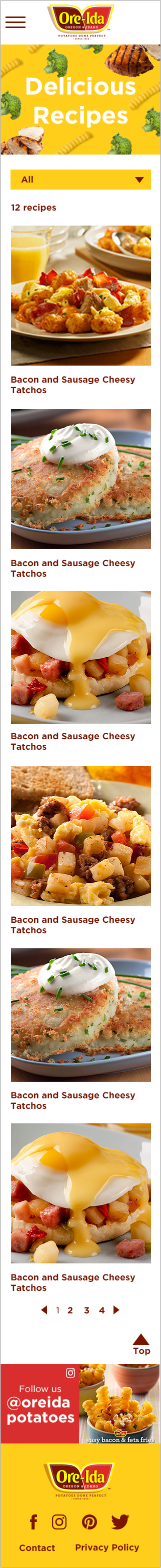
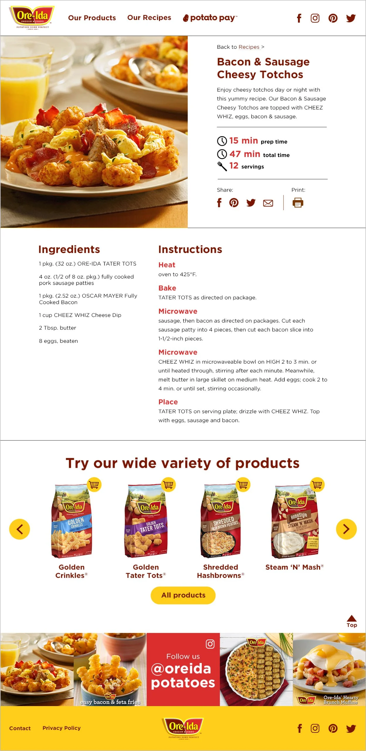
Recipe landing page
The recipe page follows the same structure as the product landing page for familiarity.
On desktop, the grid expands to four columns to show more content at once. A top tab (dropdown on mobile) makes it easy to filter by recipe type and quickly narrow results.
Recipe detail page
Recipe pages follow the same structure as product pages for consistency.
Layouts are clean and friendly, making it easy to browse recipes and spot health benefits.

Dev handoff & implementation
Developer work wasn’t part of my role, but I ensured a smooth handoff by delivering clean final designs, a clear style guide, and complete assets. I also guided a junior designer in creating the style guide.
Impact & outcomes
Created Ore-Ida’s first full digital experience, turning a blank slate into a usable, scalable website.
The final designs gave the brand team a flexible foundation they could grow and update without redesigning from scratch.
Close collaboration with the brand manager helped align vision, move quickly, and launch with confidence.
Team feedback
“Nancy is the most stellar leader and design partner I could have ever asked for. I have learned so much from working with her over the past year. She has such a kind and impactful way of giving feedback, and challenges me to produce the best work possible. I value her opinion and design eye more than anyone. Not only is she someone I can look up to, she also knows how to put her head down and crank out beautiful work on tight timelines. She is proactive on all of her projects, solving problems before they get too big. If a problem does arise, Nancy maintains her composure, positive attitude and calming tone with everyone.” — Leo Burnett UX Designer