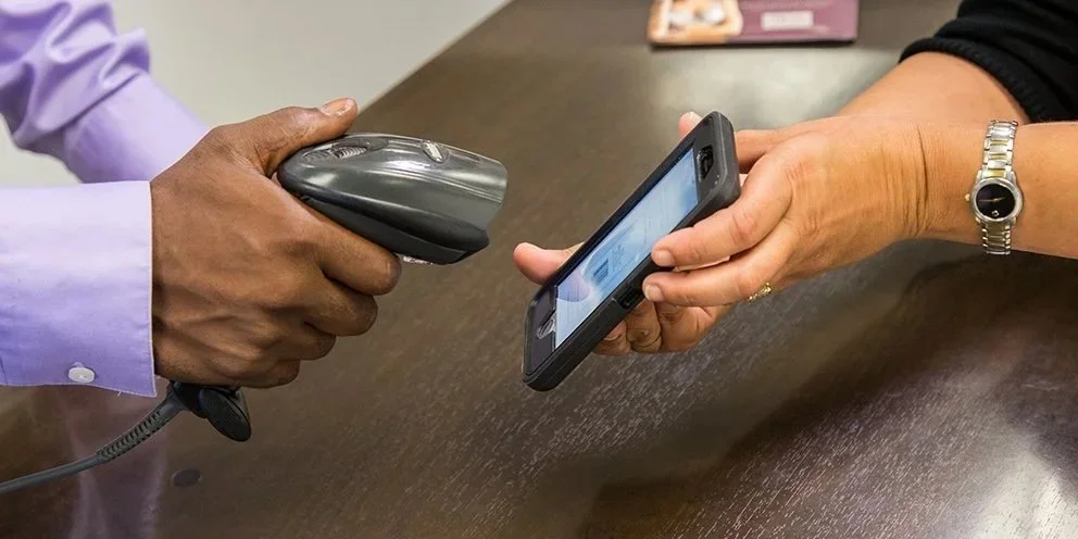

Kohl's shopping app
Lead Product Designer • iOS and Android
Key contributions
Shipped 11 customer flows from concept through launch, all on schedule.
Created shared interaction patterns across iOS and Android, reducing repeated design work while preserving native behaviors.
Led design alignment with product, engineering, and senior leadership to keep releases moving.
Mentored 6 product designers and helped create consistency across their work.
Business context
18M app adopters.
$19.1B in annual sales.
Top-25 U.S. retailer connecting digital shopping with a large physical-store network.
The problem
After a major app redesign, several critical shopping flows (including store pickup and checkout) were still unfinished, and interaction patterns differed between iOS and Android. Customers encountered inconsistent behaviors, while designers repeatedly solved similar problems instead of building from shared patterns.
The goals
🛍️ For customers
Shop with clear, consistent interactions.
Move seamlessly between online shopping and in-store pickup.
Know what to expect at each step.
🏬 For Kohl's
Establish consistent interaction patterns across iOS and Android.
Accelerate design and development through reusable patterns.
Reduce duplicated design work.
My role
Product design
Interaction design
Native iOS and Android design
Design leadership and mentoring
Design systems and reusable patterns
Cross-functional collaboration
User stories
I partnered with Product and eCommerce teams to identify the most critical gaps in the shopping experience.
I reviewed the new design system and evaluated platform differences across iOS and Android to make sure patterns felt consistent and were ready to scale. At a company serving tens of millions of users, even small friction points compound quickly. That shaped how I prioritized everything.
Final designs
Buy Online, Pick Up In Store (BOPUS)
I worked with the UX designer to design the BOPUS flow across 20 real-world scenarios, mapping edge cases and fallback states. Screens were updated to clearly communicate availability, pickup options, and next steps. The result was a predictable, trust-building purchase path that worked even when things didn't go as planned.
PDP - Available to ship
Collection page


Shopping page

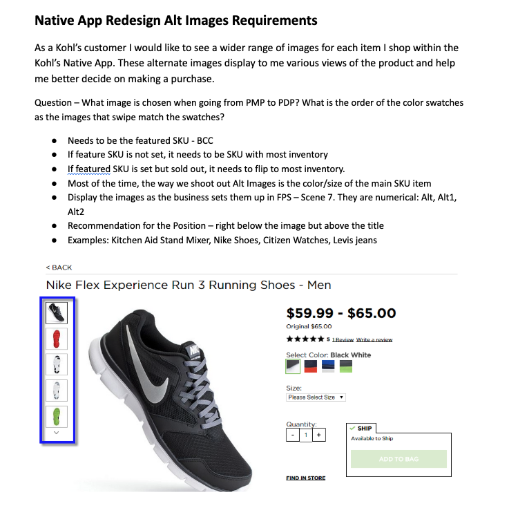
PDP image system
I defined a scalable image behavior system across 14 product states, including clear image count, swipe and zoom support, full-screen view, and consistent close behavior. Customers make purchase decisions based on what they can see. Getting this right improved confidence and reduced uncertainty at a critical moment in the shopping journey.
Default view
Alternate color


Swipe right to left

Image screen close button

Wallet notifications
I introduced a subtle notification system using a blue indicator dot and count state. Offers became easier to discover without interrupting the browsing experience.
Homepage
Expanded menu


Wallet

Sales alerts
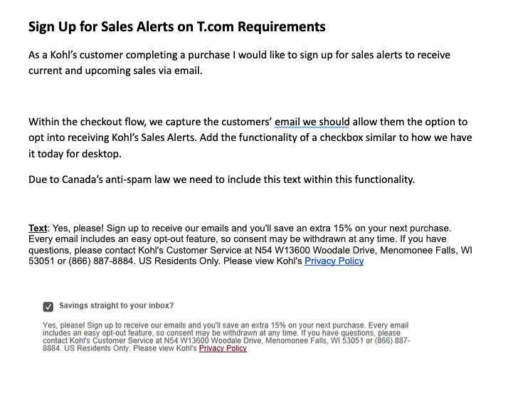
I created a consistent opt-in pattern across account creation, checkout, homepage, and preferences. Clear copy made sure customers understood exactly what they were signing up for before they agreed.
Opt-in from ‘Create an account’
Opt-in from ‘Checkout’


Sales Alerts form

About Sales Alerts

Sales Alerts thank you message

Bag restrictions
I designed clear messaging for items that couldn't be purchased in-app, including the reason, the next step, and confirmation states. Even when a purchase fails, the experience needs to maintain trust. This made sure it did.
Bag restrictions
BOPUS unavailable
Item removed


Mobile ads
I defined safe placement zones that supported monetization while protecting the primary shopping experience. Ads appeared above the scroll without disrupting navigation or competing with content customers were there to find.


Product Matrix Page (PMP) List View
Zero Search Results Page


Product Matrix Page (PMP)
Homepage
Adjustments along the way
As a consultant, I stepped into an ongoing redesign that was already in motion. There was no runway to ramp slowly. I needed to understand the system, identify the gaps, and start building alignment across product, engineering, and design quickly.
Leading a team of six designers in that environment meant more than just assigning work. It meant setting priorities clearly, creating enough shared structure that designers could make good decisions independently, and keeping quality consistent across a large body of work under real time pressure. I focused on communication and clarity so the team could move forward without rework slowing things down. We delivered all required flows on schedule.
Supporting development
I delivered organized, developer-ready files for iOS and Android with consistent labeling and scalable components. The files were structured so engineering could build efficiently and the team could extend the system long after the engagement ended.
Team feedback
“Nancy was a delight to work with, bringing a multi-faceted skill set to the team which extended beyond her primary focus as a visual designer. Nancy’s expertise helped make the overall products she designed stronger with timely input on user experience and the ability to tackle end to end challenges. In addition to her creative talents, I appreciated Nancy’s organization and inherent project management, communication and partnership skills.” — Kohl’s Senior Manager
“Nancy instilled a lot of trust in Kohl’s Senior Manager. He has not once heard feedback on the visual designs she has been responsible for that there was an issue (and apparently he usually does hear this about designs from the client partners) and told us that the high quality work that Nancy does is a big part of the reason this is such a high performing team.” — Accenture Senior Manager