J.P.Morgan
Designing the first digital sales platform for open banking
J.P. Morgan is the largest bank in the U.S., serving millions of businesses and consumers. This project created the first digital sales tool for open banking and digital channels.
I led the UX and UI design from concept through development and QA, designing an internal app that helped sales teams explain complex financial products in a clear, simple way.
Project overview
Role
Lead UX/UI Designer
Team
Executive strategy and client experience leaders
Sales and trade finance partners
Engineering (lead and junior developers)
Platform
Web
Key deliverables
UI designs for:
Digital sales website
Category and product detail templates
“Hear from your peers” content template
Working capital calculator
Calculator results experience
The problem
Sales teams did not have a digital, secure, and easy-to-use way to explain open banking and digital payment products to clients.
Conversations relied on slides and PDFs, which made complex topics hard to compare or understand in real time.
Discovery
I met with executive partners to understand the goals of the new sales platform and how teams explained complex products today.
I reviewed strong enterprise and consumer tools that make difficult topics easier to understand.
The best examples shared three things:
Clear hierarchy
Simple language
Clean, focused layouts
These insights helped guide the structure and direction of the experience.
Strategy
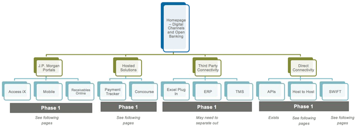
The strategy and client experience leadership team provided an initial sitemap. I reviewed it and shared feedback to ensure the structure felt clear, flexible, and easy to navigate.
My focus was making sure the site could:
support real sales conversations
scale as digital channels and products evolve
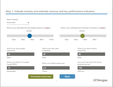
The Client Solutions Manager also shared early calculator concepts. These outlined the financial logic, required inputs, and expected outputs needed to support working capital discussions.
From there, I explored multiple design directions.
Website concepts
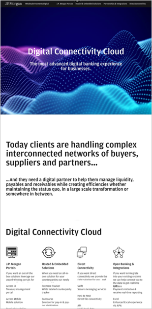
The first concept focused on a clean, minimal layout. A soft, digital hero image set the tone, while the rest of the page stayed mostly black and white.
This kept attention on the message and made the experience easy to talk through.
Calculator concepts
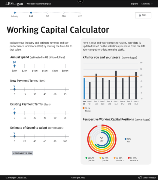
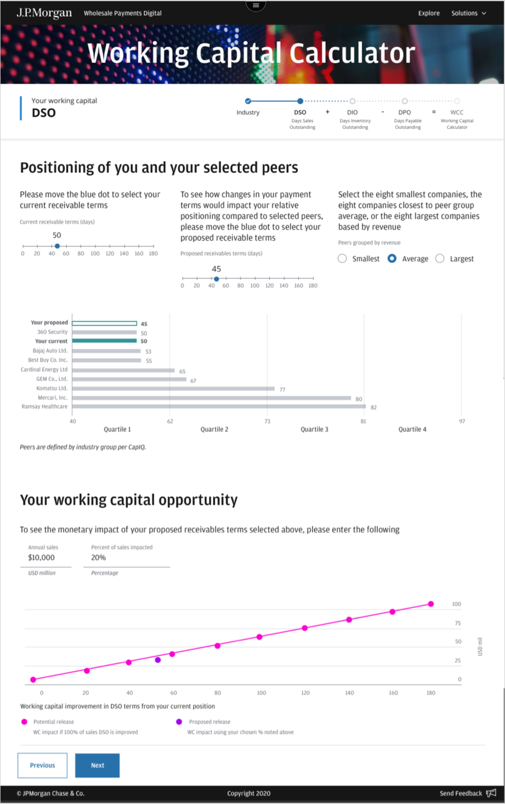
In the first version, inputs lived on the left and results on the right. A progress indicator at the top reflected the underlying formula, helping sales teams explain how values connected.
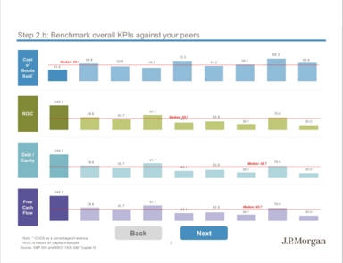
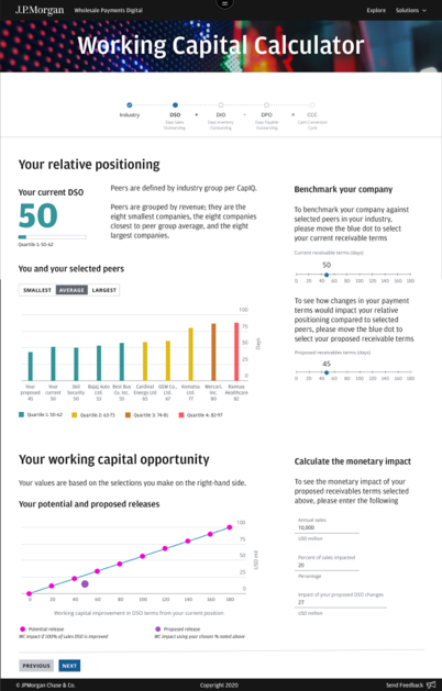
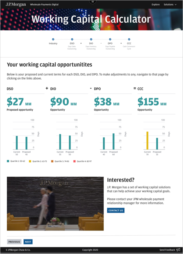
In the second version, results appeared first, with inputs acting as supporting controls. The progress indicator remained at the top, with helper text that spelled out each acronym. Charts shifted from circular to bar-based for easier comparison.
Results exploration
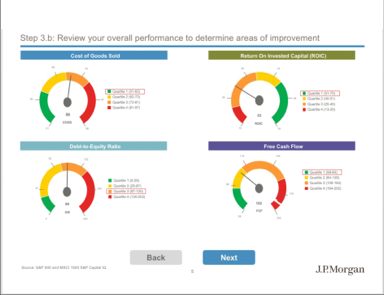
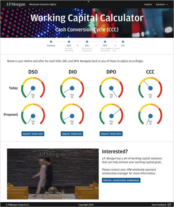
One direction explored gauge-style visuals to show movement at a glance.
Another focused on bold numbers and bar charts to clearly compare current and proposed states.
These explorations helped define a structure that allowed complex financial conversations to happen quickly without requiring deep technical knowledge.
Overcoming constraints
This work involved complex financial topics that required deep subject-matter expertise.
As the sole UX/UI designer, I partnered closely with the Client Solutions Manager, executives, and sales leads. They brought the financial knowledge; I translated it into a clear, usable experience.
Frequent reviews and fast feedback loops helped us move quickly while ensuring the tool worked for real sales conversations.
Final designs
Homepage
I designed the homepage to support live sales conversations.
A connected metal-circle visual reinforces digital connectivity, while lean layouts and short copy keep each section easy to talk through.
Content appears inside laptop-style frames, helping the site feel familiar and presentation-like for sales teams.
Each section acts as a clear talking point — not a script.
Category pages
Each of the four business categories follows the same clear structure:
About
Description
Awards
Products
This consistency helps sales teams know where to look every time.
Large landscape and architecture imagery conveys scale, stability, and trust, while keeping copy intentionally brief.
Additional page banners
Product detail pages
I designed 13+ product pages using a shared, predictable layout:
Intro and brief description
Product shown in a device frame
Benefits and features
Learn more (guided tour)
Testimonials
This structure keeps conversations flowing and makes it easy to compare solutions without distraction.
Additional page banners
Interactive calculator
The final calculator design supports real-time discussion.
Inputs and results are clearly separated, with a progress indicator showing how values connect.
As inputs change, charts update instantly making scenarios easy to explore together.
Results experience
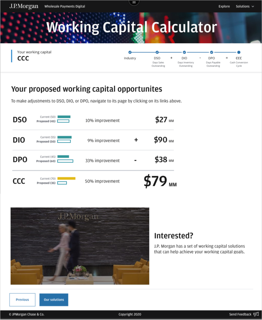
The results view was simplified for fast comparison.
Bar charts and values ertically stacked values mirror how people naturally compare numbers.
This makes outcomes easier to scan and easier to explain.
Dev handoff & implementation
I partnered closely with the development manager and junior developer during build. I reviewed work in progress, answered questions, and handled design QA to make sure the final product matched the design intent and shipped smoothly.
Impact & outcomes
Delivered a clear, modern sales site and interactive calculator that helped teams explain complex financial products in live client conversations.
The system was designed to scale, making it easy to add new products and update content without redesigning core pages.
The work improved clarity, reduced friction during sales discussions, and created a strong foundation for future growth.
Team feedback
“Nancy is a gifted visual designer. She was the lead designer on a new sales collateral platform we built. She took the vision and content and created beautiful, simple designs that have redefined how we showcase our digital solutions. She’s a pleasure to work with and eager to get it right. Nancy takes feedback very well and uses it to work with the dev and product team to build easy to use solutions.” — Executive Director, Strategy & Innovation
“Nancy worked on my Wholesale Payments Experience Design team as a visual designer for the past two years. She brought energy, dedication and a collaborative approach to every problem. She is talented in her craft, has a growth mindset and would be a terrific asset to any digital design team. She helped us create better client experiences across many programs and projects. I'd be delighted to work with her again.” — Executive Director & Head of UX Design, Wholesale Payments
