Frosted Mini Wheats
Designing the brand’s first digital presence
Frosted Mini-Wheats is a classic Kellogg’s cereal first introduced in 1969. This project marked the brand’s first responsive website.
I led the UI design from concept through launch, working closely with brand managers and a UX designer to create an experience that felt energetic, wholesome, and strong.
The final design brought the Built for Big Days campaign to life in a bold, simple, and family-friendly way.
Project overview
Role
Lead UI Designer
Team
Brand managers
UX designer
Producer
Junior UI designer
Platform
Web
Deliverables
Homepage
Product and nutrition templates
Products landing page
Campaign promo page
Support pages (FAQs, contact, 404)
The problem
Frosted Mini-Wheats is a familiar household brand, but it didn’t have a website. Many customers were unaware the brand offered multiple flavors, and there was no digital place to explore them.
Discovery
This project marked the brand’s first digital presence.
I worked with brand managers and a UX designer to understand:
campaign goals
product lineup
tone of voice
I reviewed family-focused brands to see how they create energy without overwhelming users.
Key insights:
Many people didn’t realize how many flavors existed
Bold visuals helped bring energy online
Clear structure made exploration easier
These learnings helped guide the experience direction.
Strategy
I partnered with the UX designer to shape and refine wireframes for the brand’s first digital presence.
Through iteration, we focused on:
clear structure
easy exploration
flexibility for future updates
The result was a strong foundation for a bold, energetic brand experience.
Overcoming constraints
The brand’s color palette created contrast challenges, especially with lighter tones.
To improve readability, I introduced a darker orange inspired by the packaging and paired it with blue for structure and balance.
This approach improved accessibility while preserving the brand’s energy and personality.
Final designs
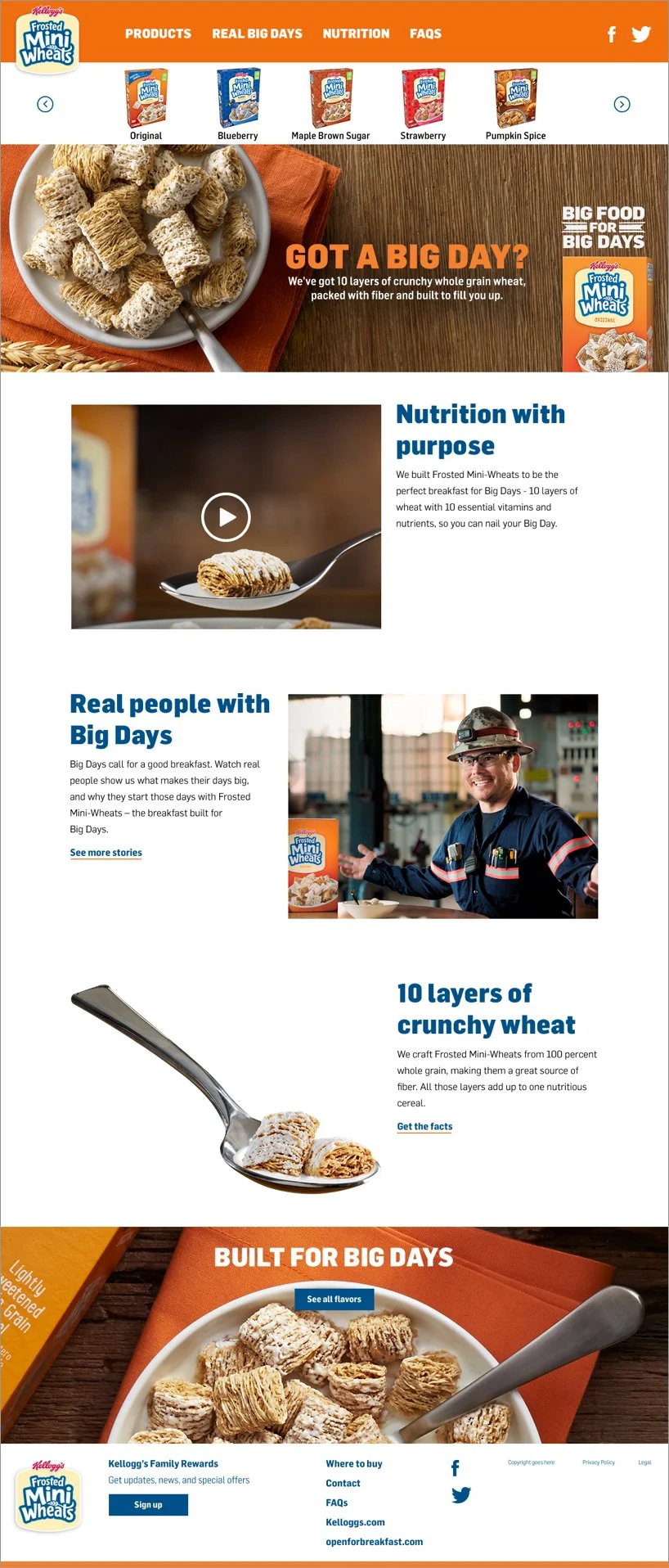
Homepage
I aligned early with the brand on one clear direction.
Bold color, large imagery, and simple layouts support the Built for Big Days campaign. Colors meet accessibility standards, and copy stays short for easy scanning.
Product landing page
This page showcases all nine Frosted Mini-Wheats products, with a banner highlighting the newest item.
The layout is clean and easy to scan, using large product images and simple cards. Each card shows only key details (product name, grams of whole grain, and grams of fiber) so users can compare products quickly without extra noise.
Product detail page (template)
A flexible layout with large product imagery puts the cereal front and center and reflects the brand’s bold, energetic personality. Key nutrition values are highlighted in bold orange for quick scanning, with related products shown below to encourage discovery across desktop and mobile.
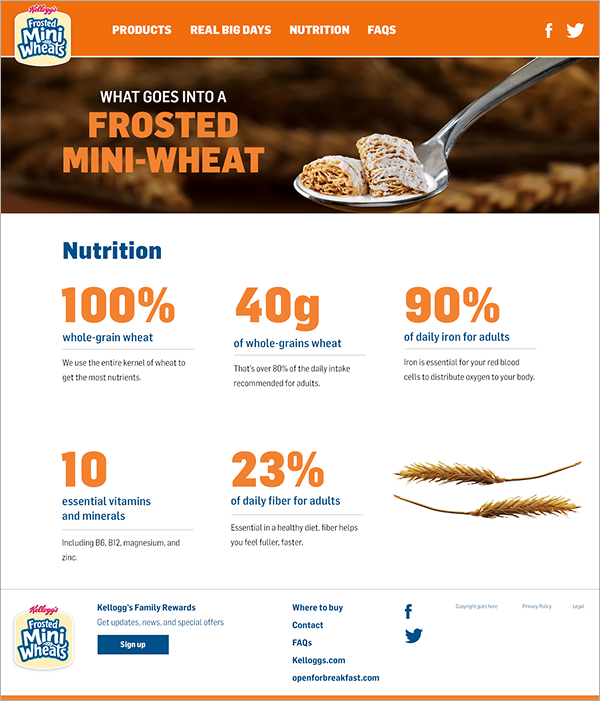
Nutrition page
The nutrition page highlights key values like protein, fiber, and whole grains using bold orange type inspired by the Built for Big Days campaign.
Blue labels provide clear contrast and help explain what each value represents (for example, “whole grain wheat”). The layout prioritizes readability, making detailed nutrition information easy to scan and understand.
Dev handoff & implementation
Developer work wasn’t part of my role, but I delivered clean, final designs to support a smooth handoff.
Impact & outcomes
Delivered a bold, energetic website that supported the Built for Big Days campaign while keeping product and nutrition info easy to scan.
The design system provided a strong foundation for future updates, new products, and campaign extensions.
This work showed how clear structure and brand alignment can support both storytelling and everyday use.
Team feedback
“Nancy is the most stellar leader and design partner I could have ever asked for. I have learned so much from working with her over the past year. She has such a kind and impactful way of giving feedback, and challenges me to produce the best work possible. I value her opinion and design eye more than anyone. Not only is she someone I can look up to, she also knows how to put her head down and crank out beautiful work on tight timelines. She is proactive on all of her projects, solving problems before they get too big. If a problem does arise, Nancy maintains her composure, positive attitude and calming tone with everyone.” — Leo Burnett UX Designer


