CVS Health – Transfer prescription
Reducing friction in a high-impact pharmacy conversion flow
This project focused on improving the prescription transfer experience across iOS, Android, and web.
I used analytics and pharmacy UX patterns to reduce confusion, clarify steps, and help more customers complete this important flow.
Project overview
Role
Lead UX/UI Designer
Team
Product leadership
Product stakeholders (Business)
Research and accessibility partners
Content designer
Design system team
iOS, Android, and web engineers
Junior UX/UI designer
Platform
iOS • Android • Web
Key deliverables
End-to-end transfer flow (steps 1–5)
Add patient and post-transfer screens
Error and edge-case scenarios
Reusable component patterns
Design QA templates and documentation
The problem
Prescription transfers are a high-value customer action, but the existing experience caused confusion and early drop-off. Improving clarity and completion was a key opportunity for both customers and the business.
Discovery
I partnered with product and business stakeholders to review analytics and identify where customers were leaving the flow early.
Since I supported the legacy designs through development and QA, I had a clear view of the full end-to-end experience.
I also reviewed leading pharmacy apps (Walgreens, Amazon Pharmacy, Capsule). The strongest patterns were simple, guided, and placed less work on the customer.
Strategy
This work built on the clarity established in Your orders and extended those patterns into the transfer flow.
The goal was consistency, so customers would see familiar layouts, language, and next steps across related pharmacy experiences.
I created mobile-first wireframes using scalable design system components to explore both standard and edge-case scenarios, including error handling. A few examples are shown below.
Choose a patient
Removed the global logo navigation to maintain a task-focused, step-by-step experience
Added a progress indicator to help users stay oriented
Removed the illustration to keep the screen focused and save space
Cut extra copy so the instructions feel simple and easy to scan
Made “Add someone else” a link, so the main action stays the focus
Legacy design
Redesign
Choose current pharmacy
Updated this step to reflect the full 5-step transfer flow
Surfaced the CVS-to-CVS transfer option upfront to prevent wasted effort
Combined pharmacy search into one field (name, ZIP, or address) to reduce friction
Removed radio button and let users select by tapping a pharmacy row
Kept phone number as a secondary option for edge cases
Moved refill rules into a modal to keep the screen focused on the task
Legacy design
Redesign
Choose current pharmacy: Results
Updated this step to reflect the full 5-step transfer flow
Surfaced CVS-to-CVS transfers upfront to prevent wasted steps
Consolidated pharmacy lookup into one search field to reduce friction
Supported search by name, ZIP, or address for faster entry
Removed “Show more locations” to keep selection quick and direct
Moved “1 refill” rules into a modal to keep the page focused on the task
Legacy design
Redesign
Choose prescriptions
Updated this step to reflect the full 5-step transfer flow
Shortened the intro copy to keep the step fast and scannable
Moved transfer exceptions (why some prescriptions may not fill) into a modal for on-demand clarity
Simplified the input label by removing “Enter” for a cleaner, more natural prompt
Removed the repeated pharmacy summary to reduce redundancy and keep focus on prescription selection
Moved refill rules into a modal to keep the page focused while still meeting compliance needs
Legacy design
Redesign
Choose prescriptions: Results
Updated this step to reflect the full 5-step transfer flow
Moved secondary explanation text into a modal to keep the screen focused on the primary task
Removed non-essential context (“My current pharmacy”) to reduce distraction
Simplified the input label by removing unnecessary wording (“Enter”)
Added helper text to guide selection and reduce uncertainty
Removed redundant headers to improve scanning and hierarchy
Removed placeholder/personalized content (“Sophia”) for consistency
Updated the primary CTA to reflect the number of selected prescriptions before continuing
Legacy design
Redesign
Choose a new CVS
Updated this step to reflect the full 5-step transfer flow
Clarified the screen goal with a more specific title: Choose a new CVS
Removed unnecessary “current pharmacy” details to keep focus on the task
Simplified search into one field (ZIP, address, or city) for faster entry
Removed the extra Search button and enabled quicker selection through live results
Reduced visual noise by simplifying typography, color, and icon use
Removed non-essential elements (logos, hours, map links) to keep scanning easy
Removed “Show more locations” to keep selection quick and direct
Moved “only 1 refill” rules into a modal to support focus and clarity
Legacy design
Redesign
Review & Submit
Updated this step to align with the full 5-step transfer flow
Simplified the title to “Review & submit” for faster scanning
Added brief instruction copy to encourage confirmation before submission
Removed the “Transfer details” header since the entire screen supports transfer review
Removed internal-only information (such as store numbers) to keep focus on user decisions
Streamlined the Edit affordance by removing extra icons, since the label alone is clear
Legacy design
Redesign
Overcoming constraints
This redesign was not formally prioritized, so I explored it independently using real insights from real user analytics.
I shared the work with designers on the Transfer team to spark discussion and inform future improvements.
This gave me space to apply systems thinking and experiment with AI-assisted workflows, while keeping the focus on clarity, scale, and user needs.
Final designs
Coming soon.
Dev handoff & implementation
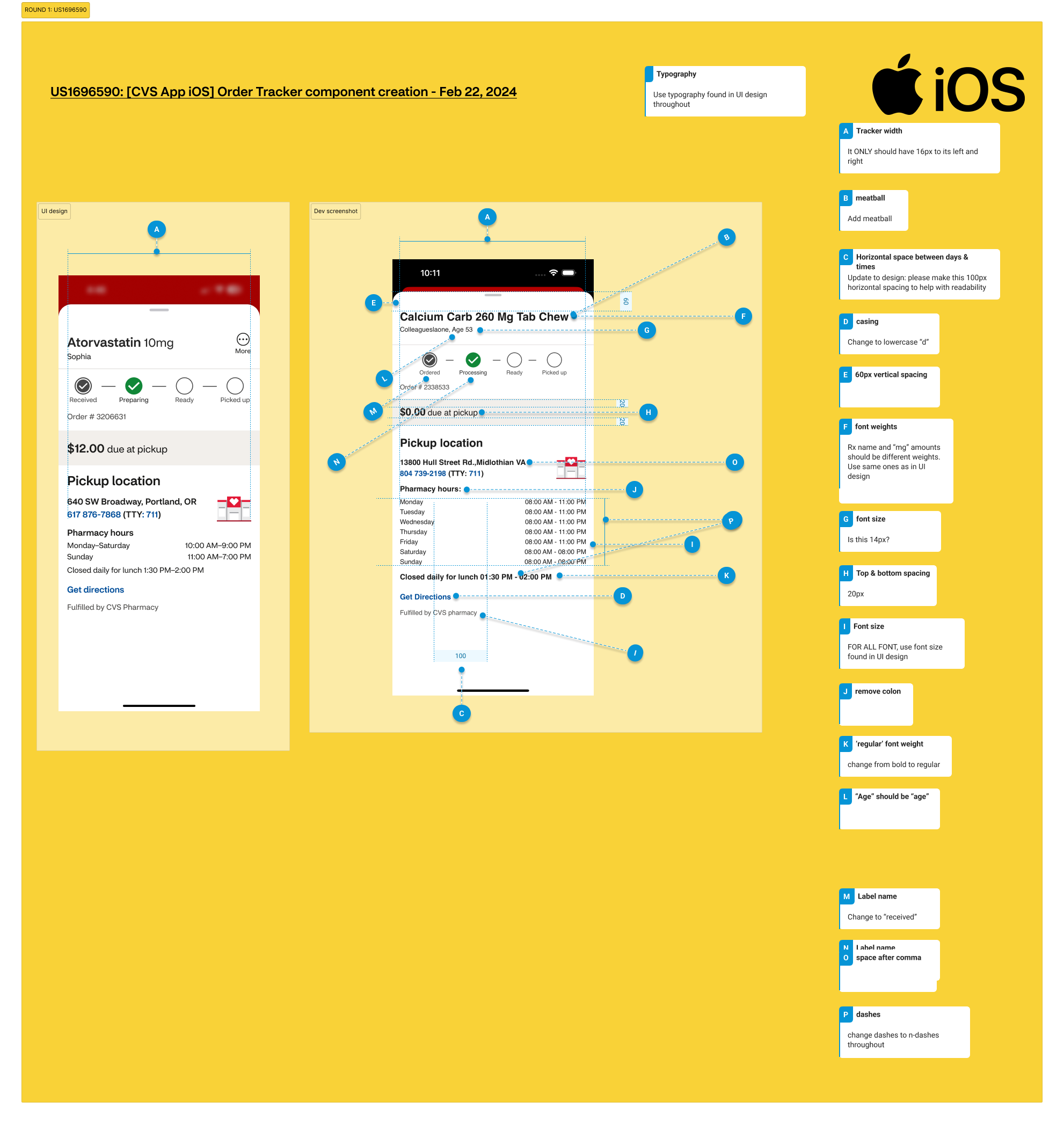
While this concept work did not ship, I supported the team in a critical way: QA.
The pharmacy design team didn’t have a QA process, so I built one from scratch. I created templates, tracking tools, and clear step-by-step guides to show what was tested, what changed, and what still needed fixes.
I also trained 20+ designers on the process and wrote documentation that new team members used as their starting point.
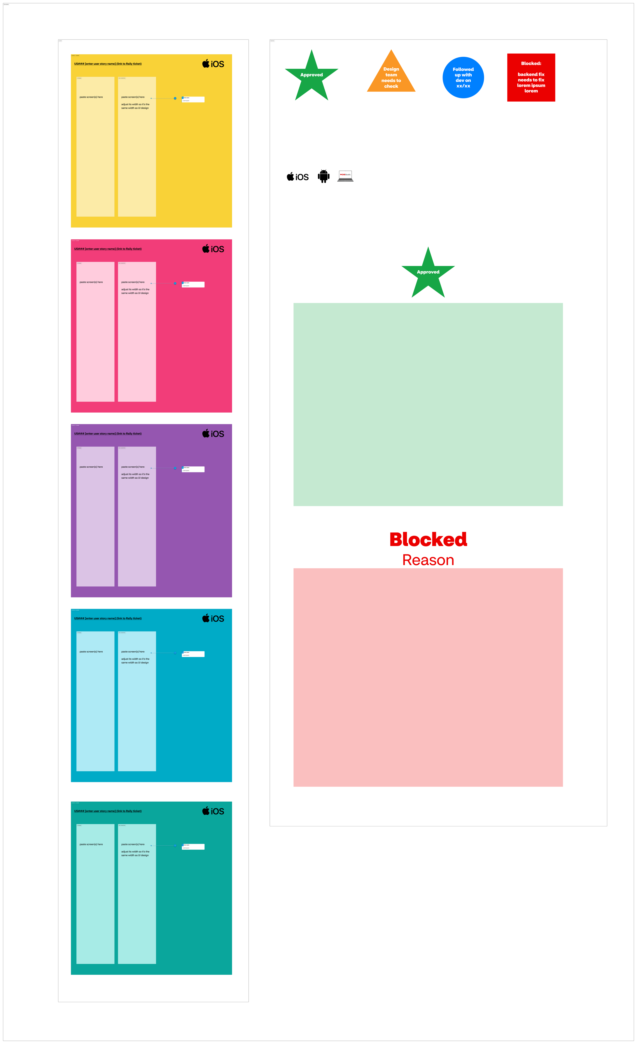
QA process I created
Create user story (Product + Engineering)
QA the work (Design)
Track outcomes
Defects found → document and assign fixes
No defects → mark complete
Reflections
Used real user insights to explore how prescription transfers could feel clearer, calmer, and easier to complete.
Even without launch, the work contributed ideas for reducing friction in a critical healthcare flow and supported future design direction.
This exploration strengthened my ability to design within constraints while keeping user needs front and center.
Team feedback
“Time and time again I’m impressed with the care, thoroughness and great quality of Nancy’s work—both how she works with people and the designs that she produces. She’s able to make good progress while collaborating with fellow designers and SCRUM team members. I note particularly how she gracefully handles many unexpected challenges that come up as details need to be worked out with development teams. When Nancy’s working on something, I’m happy to know I don’t need to worry about it, and I can look forward to excellent work and positive collaboration.” — Design Lead